用于卡片化展示数据,为ContentControl的派生类
1 | public class Card : ContentControl |
基础属性
| 属性 | 用途 |
|---|---|
| Header | 卡片头部内容,用于显示同步文本 |
| HeaderTemplate | 卡片头部模板 |
| HeaderTemplateSelector | 卡片模板样式选择器 |
| HeaderStringFormat | 卡片头部模板内容显示格式 |
| Footer | 卡片尾部内容 |
| FooterTemplate | 卡片尾部模板 |
| FooterTemplateSelector | 卡片尾部样式选择器 |
| FooterStringFormat | 卡片尾部内容显示格式 |
案例
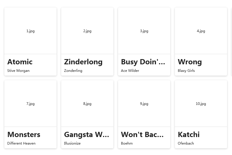
单卡片使用
xaml中使用
1 | <hc:Card MaxWidth="240" BorderThickness="0" Effect="{DynamicResource EffectShadow2}" Margin="8"> |
效果
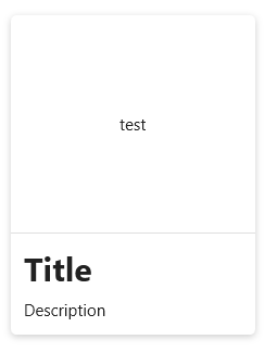
作为数据模板
数据类型
1 | public class CardModel |
视图实体
此实体并没有按照规范的mvvm方式进行设计,仅仅是作为普通数据源做展示使用
1 | public class CardDemoViewModel |
xaml中的使用方式
handycontrol的命名空间和DataContext上下文需要自行引入
1 | xmlns:hc="https://handyorg.github.io/handycontrol" |
1 | <!--在listbox的父级中使用--> |
1 | <ListBox Margin="32" BorderThickness="0" Style="{DynamicResource WrapPanelHorizontalListBox}" ItemsSource="{Binding DataList}"> |
效果