BorderRegionStyle
此样式用于包裹一个控件区域,配合基础xaml定义中的几个DropShadowEffect资源可制作如下效果:
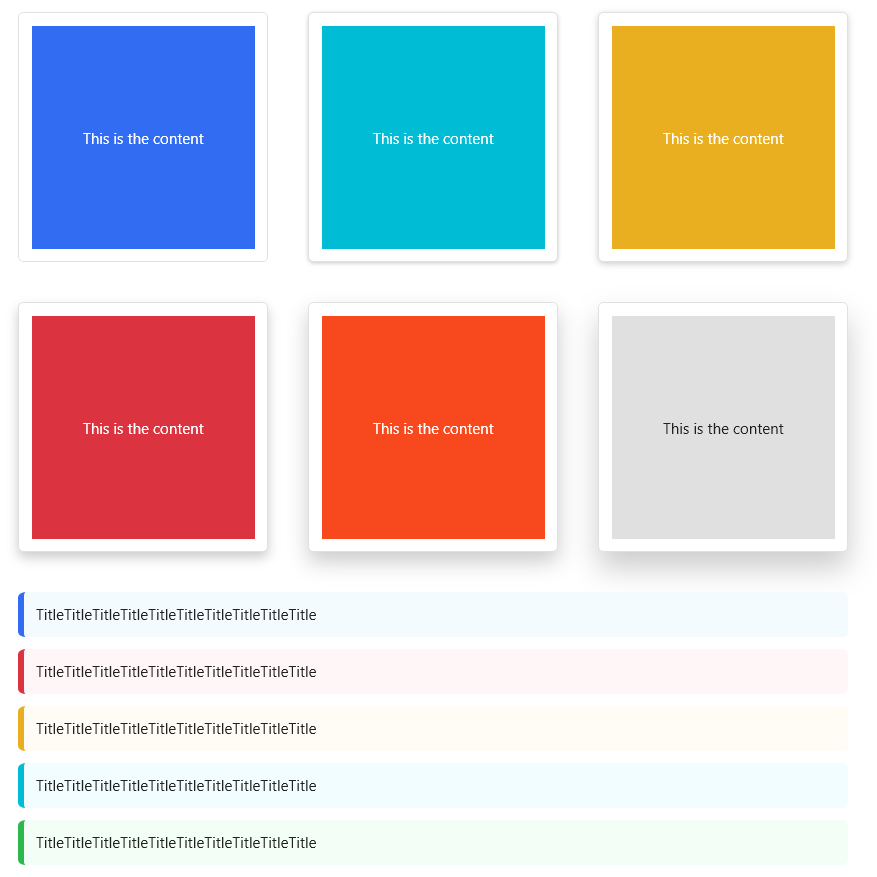
以上效果的xaml代码如下:
1 | <UniformGrid Margin="32,32,0,0" Columns="3" Rows="2"> |
提示:新版本中使用的BorderRegion,有别于老版本使用样式BorderRegionStyle,由直角变更为圆角
BorderVerticallySplitter
此样式使用1单位宽度的Border来分割横向排列的控件。
用例:
1
2
3
4
5
6
7
8
9
10
11
<StackPanel Height="20" Orientation="Horizontal">
<Ellipse Margin="5,0" Fill="OrangeRed" Width="20" Height="20"/>
<Border Style="{StaticResource BorderVerticallySplitter}"/>
<Ellipse Margin="5,0" Fill="OrangeRed" Width="20" Height="20"/>
<Border Style="{StaticResource BorderVerticallySplitter}"/>
<Ellipse Margin="5,0" Fill="OrangeRed" Width="20" Height="20"/>
<Border Style="{StaticResource BorderVerticallySplitter}"/>
<Ellipse Margin="5,0" Fill="OrangeRed" Width="20" Height="20"/>
<Border Style="{StaticResource BorderVerticallySplitter}"/>
<Ellipse Margin="5,0" Fill="OrangeRed" Width="20" Height="20"/>
</StackPanel>
BorderHorizontallySplitter
此样式使用1单位高度的Border来分割纵向排列的控件。
用例:
1
2
3
4
5
6
7
8
9
10
11
<StackPanel Width="20">
<Ellipse Margin="0,5" Fill="OrangeRed" Width="20" Height="20"/>
<Border Style="{StaticResource BorderHorizontallySplitter}"/>
<Ellipse Margin="0,5" Fill="OrangeRed" Width="20" Height="20"/>
<Border Style="{StaticResource BorderHorizontallySplitter}"/>
<Ellipse Margin="0,5" Fill="OrangeRed" Width="20" Height="20"/>
<Border Style="{StaticResource BorderHorizontallySplitter}"/>
<Ellipse Margin="0,5" Fill="OrangeRed" Width="20" Height="20"/>
<Border Style="{StaticResource BorderHorizontallySplitter}"/>
<Ellipse Margin="0,5" Fill="OrangeRed" Width="20" Height="20"/>
</StackPanel>
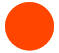
BorderCircular
此样式借助BorderElement.Circular附加属性可实现圆形Border。
用例:
1
<Border Style="{StaticResource BorderCircular}" Background="OrangeRed" Width="100" Height="100"/>
BorderClip
此样式在BorderCircular基础上添加了裁剪功能,常用于显示圆形Image。
用例:
1
2
3
<Border Style="{StaticResource BorderClip}" Width="100" Height="100">
<Image Source="/HandyControlDemo;component/Resources/Img/Album/2.jpg"/>
</Border>